
Six health programs,
one site built to be found
Visit website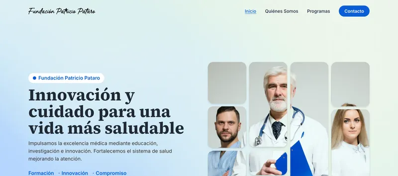
The client
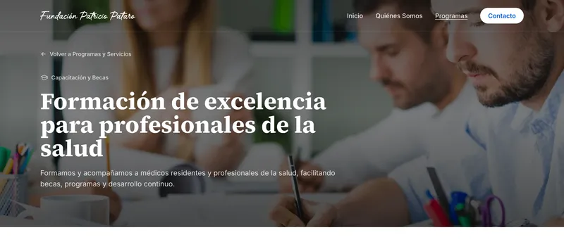
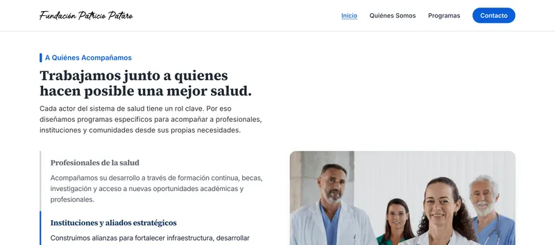
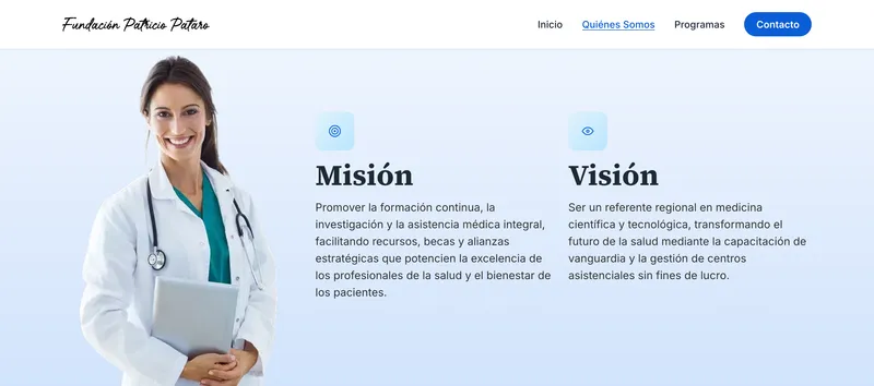
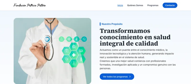
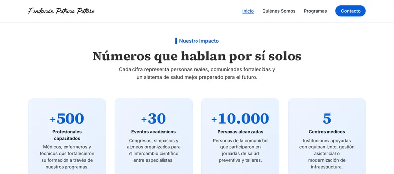
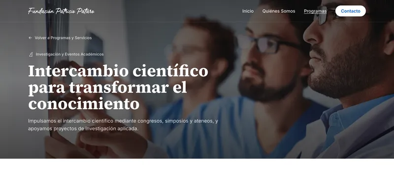
Fundación Patricio Pataro is a foundation that works on medical training, research and healthcare management. It runs six programs, for the doctors, institutions and families they reach.
An end-to-end project, by one person: I designed the website, developed it, tested it and launched it to production.
- Client
- Fundación Patricio Pataro
- Sector
- Healthcare · Foundation
- Scope
- Design & Development
- Role
- UX/UI Designer & Developer
- Stack
- NextJS · ReactJS · TailwindCSS · Figma · Design System · Accessibility
01The challenge01 / 06
The front door to six health programs. It had to explain a lot in little time, feel as trustworthy as the people behind it, work on any phone, and be found.
02Process02 / 06
From the first conversation
to launch day
How a website gets made end to end: designed, developed, tested and launched, with the client seeing and approving something real at every step, long before there is code.
- DiscoveryListen firstKickoff with the foundation to learn what it does, who it serves and what the site has to achieve.The client getsA shared brief with goals and audiences
- IdeationStructure before pixelsSitemap and wireframes, with the six programs on one shared template, so hierarchy is settled before styling.The client getsSitemap and wireframes to review
- DesignShow it, don't describe itA clickable Figma prototype with the identity applied: the client navigates it, and a change costs minutes.The client getsA clickable prototype, revised and signed off
- DevelopmentDesign into codeThe approved design built with Next.js and Tailwind CSS, with SEO and performance done alongside the pages.The client getsA preview link to follow progress
- TestingCheck it before anyone else doesEvery page reviewed on phone, tablet and desktop, then measured with Lighthouse for speed, SEO and layout shift.The client getsA tested site, ready to go live
- LaunchLaunch and hand overDeployment on Vercel under the foundation's own domain, and the site handed over live and measured.The client getsThe live site, on their domain
03Visual identity03 / 06
Human first,
clinical second.
A foundation asks for trust before it asks for anything else. The identity is built to feel like the people in it: warm in its type, calm in its color, and precise in everything else.
A serif that sounds like a person
Source Serif 4 gives headings a human voice; Inter keeps everything else clear.
One blue, used with restraint
One blue does the talking; teal is the only second voice.
04Responsive04 / 06
Built for the phone in someone's hand
Most visitors arrive on a phone, so every screen was designed for it, not shrunk down.
Layout
One design, three sizes
The same content, ordered for each screen instead of shrunk to fit it.
- Desktop · 1440
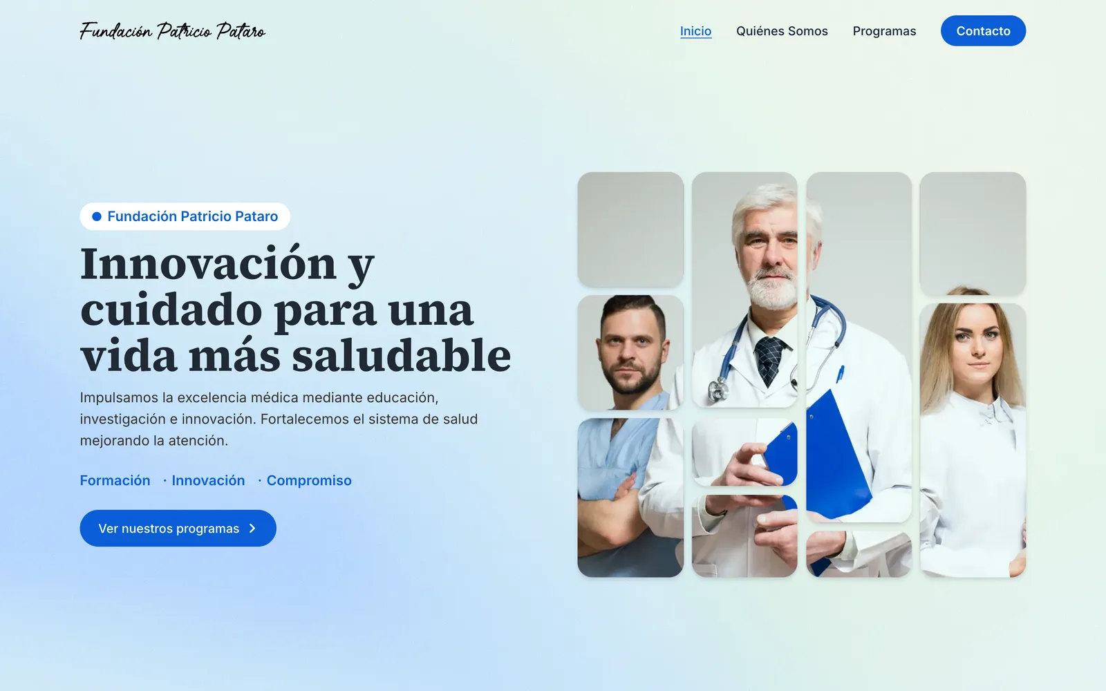
- Two columns: the message beside the photo collage.
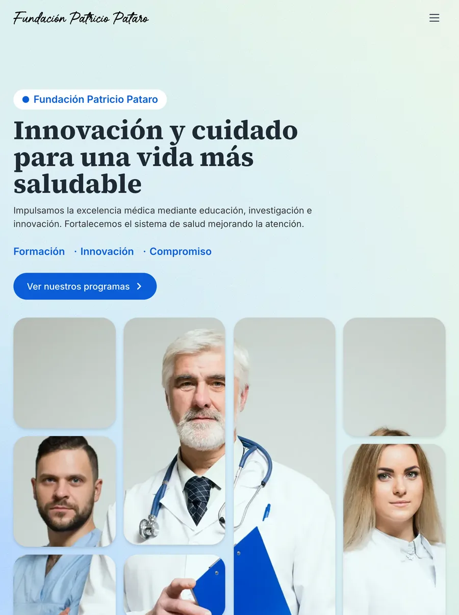
- Tablet · 768
- One column, with the collage moving under the text.
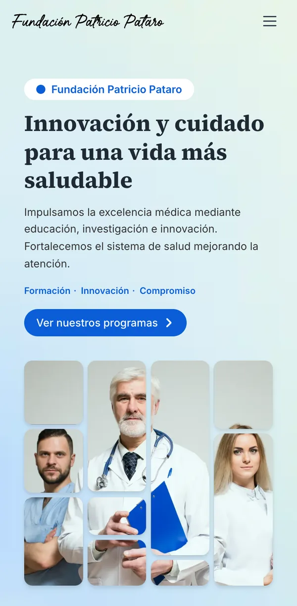
- Mobile · 390
- A full-height menu and the action within thumb reach.
05Technology05 / 06
A stack chosen for speed and upkeep
A foundation's site has to stay fast and keep working without an engineering team behind it. Each piece of the stack is there to remove a class of problems, not to add a feature.
- Next.jsEvery page built ahead of time and served as HTML.
- ReactOne component library behind all ten pages.
- Tailwind CSSThe Figma tokens, written once as theme values.
- FigmaDesign, prototype and the tokens behind the code.
- VercelDeploys from Git, served from the edge.
06Search06 / 06
Built to be found
When someone searches for the foundation, the site is there. It was built from day one so Google understands every page.
Speed
Fast is part of being found
Google favours sites that open quickly, and people don't wait for slow ones. This one is on screen in under a second.
- 96/ 100Speed
- 100/ 100Search
On every page
Everything Google needs to understand it
Each page tells search engines what it is about, so the right page shows up for the right search.
- A title and summary per page
- Who the foundation is, for Google
- A clear page structure
- A map of every page
- Previews when a link is shared
- Images described in words